Linear-space lighting is the single most important thing for graphics programmers and technical artists to know. It’s not that hard, but for whatever reason, no one really teaches it. Personally, I got a BS and MS at Georgia Tech, took basically every graphics class they had, and didn’t hear about it until I learned about it from George Borshukov. This post is essentially the short version from my talk at GDC this year. You can check out the slides for more details.
Here is the image I always start out with.
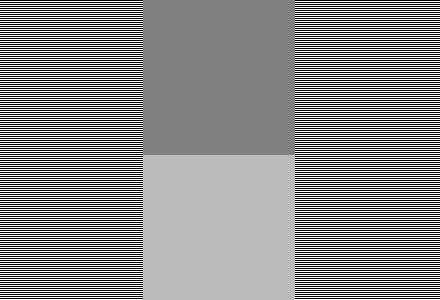
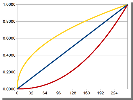
Hopefully your browser is not resizing it. The left and right are alternating horizontal lines of white and black. If you have a well-calibrated monitor, the middle-upper square should be much darker, and the middle-bottom square should be about the same intensity as the alternating lines. On the left and right side, you get essentially half-way between 0 and 255. So the color that is half-way between should be 127/128, right?
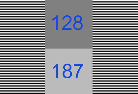
Nope. Actually, 187 is about half-way between 0 and 255. 128 is about much, much darker than half. Wtf? Btw, for all the images that look like slides, you can click on them for a higher-res version.

Here is a gradient from 0 to 255. Said another way, 128 is not actually half-way between 0 and 255. Rather, 187 is. Why? Well, there is this thing called gamma.

When you send an output value to your monitor, I always naturally assumed that the number of photons would increase linearly with the number I send it. I.e. the value 50 should send twice as many photons as the value 25. But in reality most monitors follow a gamma curve of about 2.2. If we think of our output value as being in-between 0 and 1.0 instead of 0 and 255, the number of photons will be about proportional to pow(x,2.2).
It can vary in different conditions. If you ever hear that Macs have a different gamma, it’s because their default gamma is 1.8 (although I hear they recently changed it). Also, the sRGB curve is very similar, it is actually slightly different from a gamma 2.2.

Here’s an image of me wearing an expensive mink coat that is much too small for me. Notice how the sleeves barely go to my elbows? The image on the left is what I look like with a gamma of 1/2.2 (which is close to 0.45). The middle image is linear with no changes, or a gamma of 1.0. The dark image on the right is a gamma of 2.2.

We can actually convert between gamma spaces with a power operation. Starting with the too bright image on the left, we can convert to the neutral image by applying a pow(x,2.2) to the image, and get to the one on the right by applying a pow(x,2.2) again. But, we can go the other way by applying the inverse function, which is pow(x,1/2.2).

Suppose that we built a camera without any knowledge of gamma. We would build a sensor that would take incoming light (on the left) and split each pixel into 255 levels. That image would be stored on our hard-drive (middle). But, when the user would look at the image on their screen, the monitor would apply a gamma of 2.2 (right). If we did this, users would complain that our camera sucks because the image on their screen doesn’t match what they see in the real world.

You could try to explain to them that the camera is correct and literally everyone’s monitor is wrong (including the preview LCD on the back of your camera). Good luck with that. Instead, what EVERY consumer camera does is store the image in gamma space. When the light hits the sensor, the camera applies the pow(x,1/2.2) operation to it, and then breaks it into 255 levels, and stores the result on your hard drive. Your point-and-shoot does this. Your webcam does this. Your iPhone does this. You’re SLR does this. The only cameras that do not do this are usually computer vision cameras. So the image is stored in gamma space, where it is actually kinda bright and pastel-ish. But when the user sees the image on their screen, it looks correct to them.

That’s the single most important thing you need to know about gamma. Any time you see an image on the screen (like the one on the right), the image actually stored on your hard drive is bright, and pastel-ish, and looks like the image on your left. So how does this affect computer graphics?

The left image does all the lighting calculations in gamma-space. The right image does all calculations in linear-space. If you are on the PC/PS3/360, you should be doing your lighting in linear-space. If you are on the Wii/PSP/iPhone, you gotta do what you gotta do.
The image on the left is wrong for several reasons. First, it has a really, really soft falloff, which does not look correctly. Also, you can see a lot of hue-shifting, especially in the specular highlight. It seems to shift from white to yellow to green and back to yellow. When you look at the image on the right, it looks like a diffuse surface with a white specular highlight. It looks like what the lighting model says it should look like. Finally, I’m not talking about what looks “good”, I’m talking about what is “correct”. That’s an entirely different discussion.

If you aren’t paying any attention to gamma, you are essentially following this flowchart. Suppose you have a typical shader like so:
float specular = ...;
float3 color=tex2D(samp,uv.xy);
float diffuse = saturate(dot(N,L));
float3 finalColor = color * diffuse + specular;
return finalColor;
You are first reading the texture. BUT, the texture that is on your hard drive is in gamma-space. The texture is much brighter and more desaturated than the texture you see when you look at it on your screen. So you are taking this too-bright texture, and applying your lighting model to it, for the middle image. Your monitor then applies a pow(2.2) to it which darkens it and gives you the final result. How do you fix this?

Here is the modified shader.
float specular = ...;
float3 color=pow(tex2D(samp,uv.xy),2.2);
float diffuse = saturate(dot(N,L));
float3 finalColor = pow(color * diffuse + specular,1/2.2);
return finalColor;
The only difference is the two pow instructions. When the texture is read by the hardware, it is in gamma-space (1st image). But the pow(x,2.2) converts the texture back into linear-space (2nd image). Then we do the lighting calculations (3rd image). Now that we have the final image that we want, we apply a pow(x,1/2.2) to convert it back into gamma-space. The gamma-space image is sent to the monitor, which applies it’s own pow(x,2.2) and displays the final image.
Of course, those pow() functions aren’t free in a shader. But they are in fact free if you use the hardware sampler states. For the texture read, you can use D3DSAMP_SRGBTEXTURE, and for the write to the framebuffer, you can use D3DRS_SRGBWRITEENABLE. So now your shader has the same code as before, and the hardware states give you the conversions for free.

Here is a real image of a volleyball. The top CG image is in linear-space and the bottom is in gamma-space. Note how the linear image matches the harsh falloff of the real image, but the gamma one does not.
So that’s how to make your image look “correct”. Making it look “good” is an exercise for the reader.
comments powered by Disqus