
Update: This post was originally written several years ago, as a discussion of the iPhone 4 and the “Retina Display” marketing term. The original post was quite outdated but the discussion of LCDs versus physical printing is still relevant.
Back when I wrote the original article, I had several private conversations with experts in realtime graphics. They were seriously talking about maybe we don’t need AA any more because the resolution of displays is so high that AA becomes unneccessary. That was scary to me, because if the experts who are giving presentations a Siggraph don’t understand this, then what hope does everyone else have?
Over the last 5 years, it seems like truth has triumphed over lies. Everyone I talk to in computer graphics has a good grasp of aliasing. So this post has been updated and targeted to newcomers who have questions.
As you may have heard, the term “Retina Display” started with the iPhone 4, which has 326 DPI (dots per inch). Since the resolution of the display is higher than the human retina at typical viewing distances, the marketing message is that it is the best display possible. The display is so good that if you had a better display then you wouldn’t be able to tell the difference. Technically “Retina Display” is just an Apple marketing term, but the marketing narrative was pretty clear. Here is the exact quote from Steve Jobs:
“It turns out there’s a magic number right around 300 pixels per inch, that when you hold something around to 10 to 12 inches away from your eyes, is the limit of the human retina to differentiate the pixels.”
So here is the exact quote from Apple’s own website. The link now redirects to the iPhone page, but the WayBack Machine never forgets.
Thanks to the Retina display, everything you see and do on iPhone 4 looks amazing. That’s because the Retina display’s pixel density is so high, your eye is unable to distinguish individual pixels. Which means Text in books, web pages, and email is crisp at any size. Images in games, movies, and photos pop off the screen. And everything is sharper.
Original link: http://www.apple.com/iphone/features/retina-display.html
These days, Apple uses the term “Retina Display” as a generic marketing term. Steve Jobs manipulated the gullible tech media in 2011. In other news, water is wet. That being said, if you work in graphics it is important to understand the differences between how screens work and the limits of human perception.
Part 1: Is 300 DPI Enough? Instead of talking about the theory of human vision, let’s just test this on your screen with your eyes right now. Then we’ll talk about theory. If you look at this on your phone, you have to make sure that your phone is displaying these images with a 1:1 pixel ratio.
There are two kinds of crosses here. One set of crosses is made by solid lines, and the other one from stippled dots. As you get farther from the screen, both crosses will start to look the same, although one set of crosses might be brighter or darker than the other depending on gamma. Anyways, take a note of how far away you have to be for the dots to blur together.

For most of you, you are viewing this page on a desktop. You can do the math and figure out the DPI of your monitor, but it’s probably about 100. For me, that distance is about 5 feet. At 3 feet I can clearly see the dots, and at 5 feet I can tell the intensity difference between the crosses, but I can’t discern the dots. So a “Retina Display” would hit the resolvable resolution limit for me eyes with a DPI of 500. But is that the real test of the limits of my visual system?
What you might like to know is that 1 dot is not 1 dot. Here is another image. This image contains both jagged lines and anti-aliased lines. Now do the same thing and keep going back until you can’t see the jaggies in the lines.

For me, that distance is somewhere around 10 feet. At 6 feet, the anti-aliased lines are really obvious. At 8, I have to focus, but I can clearly see some kind of waviness in the nearly horizontal and nearly vertical lines. Btw, I have decent vision, but not great. I wear contacts with a prescription of -2.25. With correction, I might be slightly better than 20/20, but I’m definitely not a sharp-sighted freak of nature. Yet by my calculations, in the second image, I’m able to see artifacts even at a size equivalent to 1000 DPI, slightly higher than the “Retina Display” with 326. Also, the lines example is not actually the worst-case for aliasing. If the image were rotating slowly, you would be able to see “crawling jaggies”, which are even more noticeable.
One counter-argument I often hear against these tests is that a solid black line against a white background is a rare, finicky worst-case scenario that never happens in the real world. But for most real uses, the resolution is good enough to be a “Retina Display”.
Then again, what are you doing right now? Well, you’re reading black text on a white background! These sharpness tests aren’t ridiculous scenarios, they are in fact the most common use case!
Part 2: Visual Acuity vs Hyperacuity So, as you have hopefully just proven to yourself, your resolution to determine aliasing far exceeds your ability to determine unique objects. That’s how a vernier caliper works. The issue here is “Visual Acuity” vs “Hyperacuity” (aka “Vernier Acuity”). While visual acuity is your ability to identify unique features, hyperacuity refers to your ability to determine artifacts in lines. The classic case is if two lines actually meet. For a really good discussion go here: http://www.michaelbach.de/ot/lum_hyperacuity/index.html
Essentially, it’s not possible to make a “Vernier Caliper” app on your iPhone 4. With a vernier caliper, you have to determine which sets of lines are aligned or not aligned to figure out the last decimal place of your measurement. You can’t simulate this on your iPhone 4 because it doesn’t have enough resolution to create those sharp, misaligned lines at a typical viewing distance.
And to do a scientific test to determine your Visual Acuity vs your Hyperacuity, take this test: http://michaelbach.de/fract/index.html
Most people think about the human eye as if it is like an LCD display. We have rods and cones which sense brightness and color. And most people think that that signal is fed directly into our brain. In reality, that’s not what we see at all. We see a highly processed version. If you want to learn more about this, I highly recommend that you get a copy of “The Biology of Seeing” by Margaret Livingstone. Also, thanks go to David Luebke of NVIDIA (one of our best champions in the gamma war) for sending me some info on this.
I’ll let the good people of Wikipedia explain this one: Vernier acuity measures the ability to align two line segments. Humans can do this with remarkable accuracy. Under optimal conditions of good illumination, high contrast, and long line segments, the limit to vernier acuity is about 8 arc seconds or 0.13 arc minutes, compared to about 0.6 arc minutes (20/12) for normal visual acuity or the 0.4 arc minute diameter of a foveal cone. Because the limit of vernier acuity is well below that imposed on regular visual acuity by the “retinal grain” or size of the foveal cones, it is thought to be a process of the visual cortex rather than the retina. Supporting this idea, vernier acuity seems to correspond very closely (and may have the same underlying mechanism) enabling one to discern very slight differences in the orientations of two lines, where orientation is known to be processed in the visual cortex.
In other words, if you want to make a display that is so good that your retina can’t tell the difference, then you need a DPI that gets beyond your range of Vernier Acuity, rather than Visual Acuity. The human vision system is truly amazing, and our visual perception of sharpness and aliasing is ridiculously good.
Part 3: Screens vs Ink: Another important consideration is the surface tension of ink. When you have two water droplets next to each other, and they barely touch, you don’t see a hard edge between them. Instead, they combine into one smooth drop because of surface tension. You can look it up, but the basic idea is that water droplets want to have as little surface area as possible for their given volume. So when two water drops barely touch, they combine into one larger drop to minimize the surface area.
The same thing happens with ink. If you print an aliased edge of dotted ink droplets, the drops merge together and smooth out the lines. That does not happen on a computer screen. With ink, even at 150 dpi, you wouldn’t see any aliasing problems. And with water droplets, at 5 dpi you probably won’t see any aliasing as long as they touch.
Also, in Steve Jobs’s quote, he says that 300 DPI is commonly accepted as good enough. Is this true? Not really. For images, yes, 300 DPI is the common standard (such as for stock photos). For text, not at all. For example, my printer does not have a 300 DPI setting. I can choose either 600 or 1200. No one prints the text for magazines at 300 DPI.
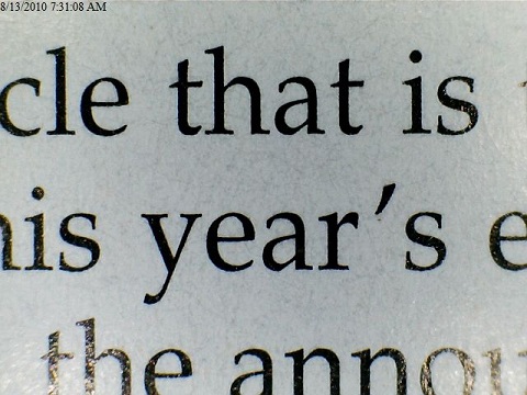
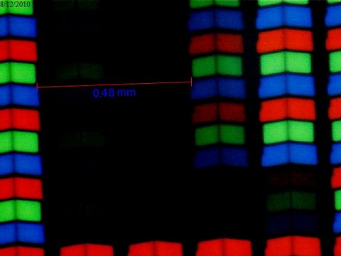
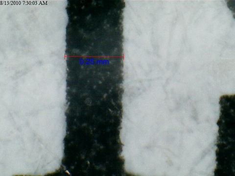
Here are some screenshots comparing the Kindle to the iPad to Magazines/Books/Newspaper. Of course those tests are looking at an iPad, not an iPhone 4. So for the iPad images, imagine the same thing but smaller. With the ink examples notices how you don’t have any harsh aliased edges anywhere. That’s because ink naturally smooths itself out, whereas the iPad has harsh aliasing problems, and so does the Kindle to a lesser degree.
First, here is iPad vs. Magazine at 26x:

And here is the iPad at 375x and the Magazine at 400x:
Wow. Even if we were to triple the iPad’s resolution to get it up to the iPhone 4, it would still get destroyed by the magazine print. Also, look at the “y”. Notice how even though it’s slanted, you get a perfectly crisp line. For any lines that are angled (as opposed to vertical or horizontal) on the iPad, you have to make the pixels on the edge half-bright or so. Yeah, those printing guys know what they’re doing.
And yes, this level of quality does make a difference. As a test compare a typical printed novel to a high-quality magazine. If you are like me, the magazine text feels crisper and cleaner than the novel. The difference is not life-changing, but still noticeable.
One final point worth noting is that as you increase the resolution of a display you get diminishing returns. Going from 75 DPI to 150 DPI makes a huge difference. 150 DPI to 300 makes some difference. Going from 300 DPI to 600 DPI makes a smaller difference. A screen at 300 DPI from a foot away is a very good display, but it’s not so good that it goes beyond the reach of your visual system.
Finally, this conversation has implications for video games. At some point screens will become so crisp that we won’t have to use anti-aliasing. Unfortunately, that day is very far away.
Conclusions:
- Most displays on phones are excellent, and most displays are at 300 DPI.
- If I'm looking at my cell phone from 12 inches away, I would need about 500 DPI for me to not be able to identify unique pixels. (Visual Acuity)
- The human eye has much more resolution for determining if an edge is sharp/soft/jagged than it does with identifying unique points. (Vernier Acuity)
- Images are usually printed at 300 DPI.
- Magazines text is printed at a much higher resolution. My printer only does 600 DPI and 1200 DPI.
- Ink gives you much better edges than LCD displays due to its natural anti-aliasing ability.
- Don't trust what I say or anyone else says. Look at test images to determine if your screen's resolution is good enough for you.
- It will be a long long time before we have screens that display text as well as a magazine does. They are printed with several times more resolution than an 300 DPI, and getter better quality from the ink. By my estimate, you would need at least 10x more pixels per square inch to match the quality of print.